When you embark on the journey of logo design, it’s essential to grasp the fundamental principles that underpin this creative process. A logo serves as the visual cornerstone of a brand, encapsulating its identity and values in a single, memorable image. It’s not merely an artistic endeavor; it’s a strategic tool that communicates the essence of a business to its audience.
Understanding the purpose of a logo is crucial; it should be distinctive, relevant, and timeless, allowing it to stand the test of time while remaining adaptable to changing market dynamics. As you delve deeper into logo design, consider the various types of logos available. From wordmarks that rely solely on typography to abstract symbols that evoke emotions and ideas, each type has its own strengths and weaknesses.
You might find that a combination mark, which merges both text and imagery, offers a versatile solution for many brands. By familiarizing yourself with these categories, you can better determine which style aligns with the brand’s vision and mission, ultimately guiding your design choices.
Key Takeaways
- A logo should be simple, memorable, and versatile to effectively represent a brand.
- Researching the brand and its target audience is crucial for creating a logo that resonates with the right people.
- A strong concept and visual identity are essential for a logo to stand out and communicate the brand’s message.
- Choosing the right typography and color scheme can greatly impact the logo’s readability and emotional appeal.
- Utilizing negative space and simplicity can make a logo more impactful and memorable.
Researching and analyzing the brand and its target audience
Before you put pen to paper or fingers to keyboard, it’s vital to conduct thorough research on the brand you’re designing for. This involves understanding its history, mission, and core values. You should immerse yourself in the brand’s narrative, as this will inform your design decisions and ensure that the logo resonates with its intended message.
Take the time to explore the industry landscape as well; analyzing competitors can provide valuable insights into what works and what doesn’t, helping you carve out a unique identity for your brand. Equally important is understanding the target audience. Who are they?
What are their preferences, values, and pain points? By creating detailed buyer personas, you can tailor your design to appeal directly to these individuals. Consider conducting surveys or interviews to gather firsthand information about their perceptions and expectations.
This research will not only guide your design choices but also ensure that the final logo speaks directly to those who matter most—the customers.
Creating a strong concept and visual identity
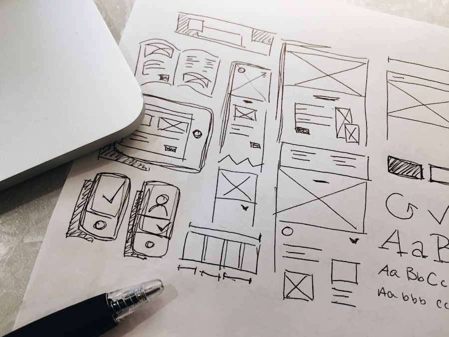
With a solid understanding of the brand and its audience, you can begin crafting a compelling concept for the logo. This stage is where creativity flourishes; brainstorm ideas that encapsulate the brand’s essence while considering how these concepts can be visually represented. Sketching out rough drafts can help you visualize different directions and refine your ideas.
Don’t hesitate to explore various themes or metaphors that align with the brand’s message—this exploration can lead to unexpected yet powerful design solutions. As you develop your visual identity, think about how each element contributes to the overall narrative. The shapes, lines, and symbols you choose should harmonize with the brand’s personality.
For instance, a tech company might benefit from sleek, modern lines that convey innovation, while a wellness brand may opt for softer curves that evoke tranquility. By ensuring that every aspect of your design aligns with the brand’s values and mission, you create a cohesive visual identity that resonates with both the brand and its audience.
Choosing the right typography and color scheme
| Typography | Color Scheme |
|---|---|
| Font Size | Primary Color |
| Line Height | Secondary Color |
| Letter Spacing | Accent Color |
| Font Weight | Background Color |
| Font Style | Text Color |
Typography and color are two of the most critical elements in logo design, as they significantly influence how a brand is perceived. When selecting typography, consider not only legibility but also how well it reflects the brand’s personality. A playful brand might benefit from rounded, whimsical fonts, while a luxury brand may require elegant serif typefaces that exude sophistication.
Experiment with different font pairings to find combinations that enhance readability while maintaining visual interest. Color selection is equally vital; colors evoke emotions and associations that can shape consumer perceptions. For instance, blue often conveys trust and reliability, making it a popular choice for financial institutions, while green is frequently associated with health and sustainability.
As you choose your color palette, think about how these colors will work together and how they will appear across various mediums. A well-thought-out color scheme not only enhances the logo’s aesthetic appeal but also reinforces the brand’s message.
Utilizing negative space and simplicity
In logo design, less is often more. Embracing simplicity can lead to more impactful designs that are easily recognizable and memorable. A cluttered logo can confuse viewers and dilute the brand’s message.
Instead, focus on creating a clean design that communicates effectively at a glance. This approach not only enhances memorability but also ensures versatility across different applications. Negative space is a powerful tool in achieving simplicity while adding depth to your design.
By cleverly incorporating negative space into your logo, you can create dual meanings or hidden elements that engage viewers on a deeper level. For example, the FedEx logo cleverly uses negative space to form an arrow between the letters “E” and “x,” symbolizing speed and precision. As you explore negative space in your designs, challenge yourself to think outside the box—this technique can elevate your logo from ordinary to extraordinary.
Testing and refining the logo design
Once you have developed initial concepts for your logo, it’s time to put them to the test. Gather feedback from stakeholders, potential customers, or even fellow designers to gain diverse perspectives on your designs. This feedback is invaluable; it can highlight strengths you may have overlooked or reveal weaknesses that need addressing.
Be open to constructive criticism—this iterative process is essential for refining your design into something truly exceptional. As you receive feedback, don’t hesitate to make adjustments based on what resonates with your audience. This might involve tweaking colors, adjusting typography, or even rethinking certain elements altogether.
The goal is to create a logo that not only looks good but also effectively communicates the brand’s identity. Remember that refinement is an ongoing process; don’t rush it. Take your time to ensure that every detail aligns with the brand’s vision before finalizing your design.
Delivering a versatile and scalable logo
A successful logo must be versatile enough to work across various platforms and applications. From business cards to billboards, your design should maintain its integrity regardless of size or medium. As you finalize your logo, consider how it will appear in different contexts—will it still be recognizable when scaled down for social media profiles?
Will it maintain clarity when printed in black and white? These are crucial questions to address during the design process. To ensure versatility, create multiple versions of your logo: a full-color version for digital use, a monochrome version for print applications, and perhaps even an icon version for smaller spaces.
Providing these variations will empower clients or stakeholders to use the logo effectively across different channels while maintaining brand consistency.
Keeping up with current design trends and best practices
The world of design is ever-evolving; staying informed about current trends and best practices is essential for any designer looking to create relevant logos. While it’s important not to chase trends blindly—since what’s popular today may be outdated tomorrow—being aware of emerging styles can inspire fresh ideas and innovative approaches in your work. Regularly engage with design communities through blogs, social media platforms, or industry events to stay updated on new techniques and tools.
Additionally, studying successful logos from various industries can provide insights into effective design strategies. By blending timeless principles with contemporary trends, you can create logos that are not only visually appealing but also resonate with today’s audiences. In conclusion, logo design is a multifaceted process that requires careful consideration of various elements—from understanding the brand’s essence to delivering a versatile final product.
By following these steps diligently and remaining open to feedback and innovation, you can create logos that not only capture attention but also stand as enduring symbols of their respective brands.
If you’re looking for more tips on logo design, check out the blog section of Blur&Co’s website. They offer valuable insights and advice on creating a memorable and effective logo for your brand. You can find their blog at https://www.blurandco.com/blog/.
FAQs
What are some important considerations for logo design?
Some important considerations for logo design include simplicity, versatility, relevance to the brand, and scalability.
Why is simplicity important in logo design?
Simplicity is important in logo design because it makes the logo more memorable, versatile, and easily recognizable across different mediums.
What is the significance of versatility in logo design?
Versatility in logo design ensures that the logo can be effectively used across various platforms, such as print, digital, and merchandise, without losing its impact.
How can a logo be made relevant to the brand it represents?
A logo can be made relevant to the brand it represents by incorporating elements that reflect the brand’s values, products, or services, and by aligning with the brand’s overall identity.
Why is scalability important in logo design?
Scalability is important in logo design because it ensures that the logo maintains its visual appeal and legibility when scaled up or down, such as on different-sized screens or printed materials.